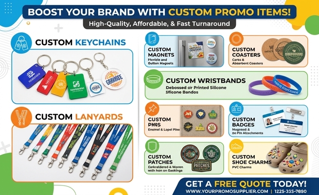
2026 Pro Maker's Guide: Custom Keychain Design Ideas
Introduction
If your keychain looks generic, it gets ignored. That is the real problem behind most custom keychain design ideas: the piece may be small, but the design still has to carry brand identity, style, durability, and emotional appeal in a space that fits in a pocket. Whether you are creating merch for a small business, giveaways for an event, or retail products for an online shop, weak design choices show up fast.
At Best Patches, we see this every day. Clients often come in with a logo and a vague concept, but not a strategy for shape, finish, attachment, audience use, or production limits. The difference between a keychain people toss into a drawer and one they actually use usually comes down to better planning, not just prettier artwork.
Custom keychain design ideas are creative and practical concepts used to turn logos, illustrations, slogans, mascots, or functional features into branded keychains. They include decisions about material, shape, color, finish, messaging, and hardware so the final product looks good and performs well in real use.
A strong design is not only attractive. It is manufacturable, cost-aware, memorable, and aligned with how people carry it every day.
Table of Contents
- What Makes a Keychain Design Work
- Top Custom Keychain Design Directions
- Materials and Finishes That Change the Result
- Matching Design Style to Business Goals
- How I Build a Keychain Concept From Scratch
- Real-World Brand Cases From Best Patches
- Common Mistakes, Risks, and Production Limits
- Design Trends Shaping 2026
- Final Thoughts and Next Steps
- References
What Makes a Keychain Design Work
A keychain succeeds when it does four jobs at once: it catches attention, survives daily wear, feels pleasant in the hand, and communicates something instantly. That sounds simple, but it forces every design choice to earn its place.
According to a 2024 report by Deloitte on consumer products and personalization, buyers continue to reward products that feel tailored to identity and self-expression. That matters here because keychains are rarely bought for pure function anymore. They sit in the category of everyday accessories, impulse gifts, fan merchandise, and low-cost branded keepsakes.
According to Adobe’s 2024 creative trends reporting, standout products increasingly depend on bold visual clarity, tactile appeal, and design systems that stay recognizable across formats. A keychain is one of the hardest places to achieve that because space is limited and wear is constant.
When I evaluate a concept, I focus on these basics first:
- Readability: Can the core message or image be understood in two seconds?
- Shape logic: Does the outer silhouette reinforce the art or brand story?
- Material fit: Is the chosen material supporting the visual goal or fighting it?
- Hardware balance: Does the ring, clasp, or chain complement the piece without overpowering it?
- Wear resistance: Will scratches, UV exposure, and drops ruin the look too quickly?
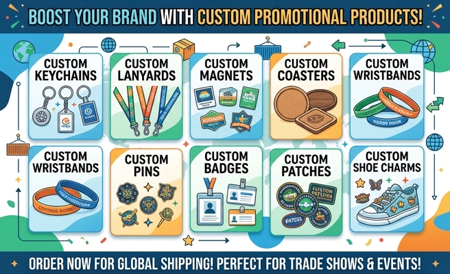
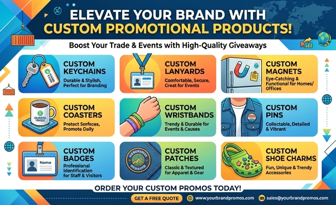
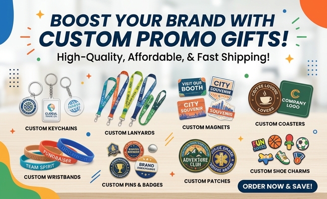
Top Custom Keychain Design Directions
Not every customer wants the same kind of keychain. A coffee shop, a gaming creator, a nonprofit, and a streetwear label should not be using the same visual formula. These are the strongest directions I recommend most often.
Logo-First Minimalist Pieces
These work best for corporate gifting, real estate branding, trade shows, and automotive businesses. Keep the shape clean, use one to three colors, and prioritize a finish that makes the logo feel premium. Soft enamel metal, debossed leatherette, and brushed zinc alloy perform especially well here.
Mascot and Character Keychains
These dominate creator merch, school spirit items, anime-inspired shops, and youth-focused brands. The character should be simplified for scale. Facial details, outlines, and accessory elements often need to be exaggerated slightly so they remain readable when reduced.
Functional Hybrid Designs
Some of the best custom keychain design ideas add a second reason to keep the item. Think bottle openers, mini flashlights, NFC tags, ruler edges, QR code backs, or trolley coin inserts. These work well for practical industries and event giveaways because usefulness increases retention.

Layered Acrylic Storytelling Designs
For artists and fan brands, layered acrylic can create depth, shadow, motion, or floating effects. Front print, back print, epoxy coating, and glitter inserts can all be combined carefully. The key word is carefully. Too many layers create visual noise fast.
Text-Driven Statement Pieces
Short quotes, local slogans, inside jokes, team mottos, or values-based messaging work surprisingly well when typography becomes the hero. The trick is to keep wording short and shape the keychain around the text instead of forcing text into a tiny generic mold.
Materials and Finishes That Change the Result
Material is not a production detail. It is the design. The same artwork can feel playful, luxury-focused, rugged, or cheap depending on what it is made from.
| Business Scenario | Best Material | Main Advantage | Watch-Out |
|---|---|---|---|
| Coffee shop loyalty giveaway | Acrylic | Low cost, bright print, easy custom shapes | Scratches faster without protective coating |
| Auto dealer customer gift | Zinc alloy metal | Premium feel and long-term durability | Higher unit cost and heavier shipping weight |
| Eco-conscious boutique merch | Wood or bamboo | Natural texture and sustainability appeal | Fine details may lose sharpness |
| Anime artist online shop | Epoxy acrylic | Vivid color and strong visual depth | Overdesigned art can look cluttered |
| Streetwear brand drop | PVC rubber | Bold contour, tactile feel, weather resistance | Small text does not reproduce well |
According to McKinsey’s 2024 consumer sentiment research, buyers across categories continue to weigh quality signals heavily when deciding whether a branded product feels worth keeping. That translates directly to finish decisions. Matte can feel modern. Gloss can feel energetic. Antique plating can feel collectible. Transparent acrylic can feel youthful and graphic.
My rule is simple: if the art is detailed, use a material that supports precision. If the goal is tactile impact, use a material that rewards touch. If the piece is meant to signal status, spend on weight and finish before adding decorative extras.
Matching Design Style to Business Goals
A beautiful design can still fail if it solves the wrong business problem. Before sketching anything, identify the actual use case.
For Brand Awareness
Use clear logos, high contrast, simple silhouettes, and recognizable colors. Event giveaways need speed of recognition more than artistic subtlety.
For Retail Sales
Focus on collectibility, aesthetic cohesion, and emotional pull. Retail keychains need to feel giftable and personal, not merely promotional.
For Community Building
Use insider references, local symbols, milestone years, or member-only visuals. These designs gain value because they represent belonging.
For Premium Gifting
Use metal, leather, or mixed materials. Keep graphics restrained. Fine lines, engraved details, and subdued color palettes generally outperform louder concepts in executive or luxury settings.
“The strongest keychain designs behave like miniature brand systems. They are not random art on a ring. They compress identity into a form people will carry without effort.”
How I Build a Keychain Concept From Scratch
When clients ask me for design direction, I do not start with colors. I start with use. A keychain is touched, dropped, pocketed, scratched against metal, and seen in motion. If you design only for a flat screen mockup, you miss the actual job.
Here is the process I recommend:
- Define the audience. Are you selling to collectors, loyal customers, event attendees, or employees?
- Choose the purpose. Is it meant to advertise, sell, commemorate, or function as a practical tool?
- Select the shape family. Circle, rectangle, badge shape, die-cut contour, mascot silhouette, or object-inspired form.
- Match the material to the artwork. Detailed illustrations usually favor acrylic or print-based methods. Bold icons often work better in PVC or enamel metal.
- Reduce the message. Keep text short, remove micro-details, and simplify decorative noise.
- Prototype at real size. Print the art physically and check readability from arm’s length.
- Stress-test production. Review attachment holes, edge safety, coating options, and likely scratch points.
I also advise teams to test one premium version and one volume-friendly version of the same concept. That gives flexibility for both retail and promotional use without redesigning everything from zero.
Real-World Brand Cases From Best Patches
I have worked on enough small-format merch to know that clients often underestimate edge detail and hardware scale. At Best Patches, one of the most useful case studies came from a regional coffee brand that wanted a collectible keychain series tied to seasonal drinks. Their first concept used complex illustrated cups, script lettering, and a dark background. On screen, it looked stylish. At production size, it looked muddy.
I recommended we switch to a die-cut acrylic series built around cup silhouettes, bold seasonal colors, and one flavor icon per design. We moved the campaign hashtag to the back, increased the border thickness, and changed the clasp to a gold-tone swivel hook to make it feel gift-ready. The result sold through faster than the client expected because each design felt clean, distinct, and collectible rather than overworked.
In another project, I helped a startup apparel label through Best Patches develop launch-day accessories. They initially wanted a flat logo keychain, but the logo itself did not have enough visual personality to drive merch sales. I pushed for a PVC design based on their mascot hand symbol instead. We kept the logo small on the reverse side and let the front become a tactile, high-contrast shape. The final piece performed better both as a checkout add-on and as a social media prop because it photographed well and read instantly.

These projects reinforced a lesson I return to constantly: the best keychain is not the one that contains the most brand information. It is the one that survives editing.
“If a design only works when enlarged on a monitor, it is not ready. Great keychain art earns its impact at actual size.”
Common Mistakes, Risks, and Production Limits
It is easy to talk about creativity and ignore production reality. That is how expensive mistakes happen. The most common issues I see are avoidable.
Too Much Detail
Thin lines, tiny type, layered shadows, and small gradients often disappear or blur in manufacturing. If a detail is crucial, enlarge it or remove competing elements.
Wrong Material for the Art
Detailed portraits in soft PVC usually lose precision. Dense typography in embroidered styles can become unreadable. Every medium has strengths and tradeoffs.
Ignoring Wear Patterns
Glossy surfaces can scratch. Printed layers can wear at edges. Clear acrylic can show abrasion. If the item will be used daily, ask how it ages, not just how it looks fresh.
Copyright and Licensing Problems
This is a major business risk. A cute fan-inspired piece can quickly become an infringement issue if it borrows protected characters, logos, or visual identities too closely. Many small sellers learn this too late, after listings are removed or inventory is stranded.
Bad Hardware Decisions
A great design can be ruined by a cheap split ring, weak clasp, or chain length that makes the piece awkward. Hardware should be part of the concept, not a last-minute default.
According to the U.S. Patent and Trademark Office’s guidance and ongoing enforcement patterns, even small merchandise categories can trigger serious trademark and copyright issues when branding is used without authorization. For sellers, that means originality is not just a creative virtue. It is risk management.
Design Trends Shaping 2026
The next wave of custom keychain design ideas is less about novelty for its own sake and more about better integration of identity, utility, and sustainability. Here is what is gaining traction.
Micro-Collectible Series
Instead of one hero design, brands are creating families of two to six related keychains. This works especially well for cafes, sports communities, travel brands, and fandom merch.
Quiet Premium Finishes
Muted metal plating, smoke acrylic, frosted surfaces, and debossed textures are replacing some of the louder visual trends from earlier merch cycles. The product feels more grown-up and more likely to be carried long term.
Eco-Minded Material Choices
Consumers are paying more attention to what products are made from. That does not mean every eco material is the right answer, but it does mean brands should be prepared to explain material choices clearly and honestly.
Smart Back-Side Utility
QR codes, short URLs, NFC integration, loyalty tags, and event verification features are growing in use. The key is to keep the front aesthetic strong while making the reverse side useful.
According to a 2025 report from Statista on promotional merchandise behavior and gifting preferences, practical branded items continue to maintain stronger retention than purely decorative throwaways. The implication is clear: if you can combine style with use, you raise the odds that your keychain stays in circulation.
Final Thoughts and Next Steps
The strongest custom keychain work is rarely the most complicated. It is the most intentional. Good designs balance shape, readability, material, finish, and user behavior. Great designs go one step further by aligning all of that with a specific business goal, whether that is sales, visibility, loyalty, or collectibility.
If you want a better result, keep your concept simple, match the material to the art, and prototype at real size before approving production. That one habit prevents a surprising number of disappointing outcomes.
Best Patches recommends these next actions:
- Audit your current logo or artwork and remove any details that will fail at keychain scale.
- Choose one primary goal for the product: promotion, resale, gifting, or community engagement.
- Request two sample directions in different materials before committing to a full run.
References
- Deloitte, 2024: Consumer product personalization trends and the growing value of identity-driven purchasing behavior.
- Adobe, 2024: Creative trend reporting on visual clarity, tactile appeal, and recognizable design systems across product formats.
- McKinsey & Company, 2024: Consumer sentiment insights related to perceived quality, value, and product retention.
- U.S. Patent and Trademark Office: Guidance relevant to trademark and copyright risk in branded merchandise.
- Statista, 2025: Promotional merchandise and gifting preference data supporting the value of practical branded items.
FAQ
What are the best custom keychain design ideas for small businesses?
For small businesses, the strongest options are logo-first acrylic designs, mascot keychains, mini product-shape keychains, and functional pieces like bottle opener styles. The best choice depends on whether you want brand awareness, retail sales, or repeat-customer loyalty.
What material works best for detailed artwork?
Acrylic is usually the safest choice for detailed printed artwork because it preserves color and fine visual elements well. Metal enamel and PVC are better for bolder, simplified designs with stronger outlines.
How do I make custom keychain design ideas look more premium?
Use fewer colors, stronger shape discipline, better hardware, and higher-end finishes like brushed metal, antique plating, or epoxy coating. Premium design usually comes from restraint and material quality, not extra decoration.
Can I put a QR code on a custom keychain?
Yes, and it can be very effective for loyalty programs, menus, event pages, or product verification. Put the QR code on the back and test scan accuracy at final size before mass production.
What size is best for a custom keychain?
A common sweet spot is around 2 to 2.5 inches on the longest side. That gives enough room for clear design without making the keychain bulky or awkward in daily use.
How can I avoid design mistakes before production?
Print the design at actual size, simplify any hard-to-read details, confirm material compatibility, and request a sample when possible. Also review edge spacing, attachment hole placement, and hardware quality before approving the run.